![]()
Redesigning Platform Architecture
Problem
Complex interface served multiple user types poorly, creating confusion and inefficient workflows.
Goal
Design clear, tailored experiences that enable users to complete tasks efficiently and confidently.
Role
Senior designer leading end-to-end redesign, partnering with 2 PMs and 2 engineering teams.
Background
RZero is a startup that offers occupancy sensors for companies to manage and strategize their office space utilization across different industries. In addition to occupancy data, the platform also captures temperature and air quality metrics. I was tasked with redesigning the user-facing occupancy analytics dashboard to transform how customers understand and act on their space utilization insights.
The Challenge: One Interface, Two Incompatible Mental Models
I inherited a dashboard trying to serve two fundamentally different user types in a single interface: Admin users needed to configure sensors, troubleshoot hardware, and manage system settings. They thought in terms of devices, sensor types, and technical health status. Workplace managers – the end-users, needed to analyze occupancy data for space planning decisions. They thought in terms of spaces, utilization patterns, and availability.
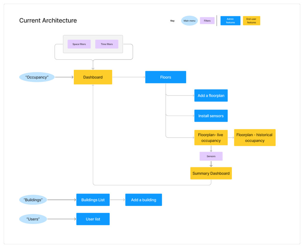
The symptom: A cluttered, confusing floor map. The real-time floor map displayed both device types (motion sensor, desk sensor, room sensor) AND occupancy status (available, occupied, offline) in the same view. The legend had 10+ items. Neither user type could quickly extract the information they needed—admins couldn’t see which sensor types were offline, and workplace managers couldn’t see which spaces were available. This wasn’t a visual design problem. It was an information architecture problem: we were forcing two incompatible mental models into one interface.
My Process: Deep Listening, Strategic Design
Discovery: Embedding with Customer Success
I joined weekly customer success calls with customers from different industries (corporate, medical, etc.) to gain direct access to user feedback. During these calls, I paid specific attention to users commenting about UI challenges. For example, during one call, a workplace manager mentioned they couldn’t distinguish between mid level utilization percentages on the floor plan. I would then probe further to learn about the underlying reasons they were seeking those mid-level percentages—understanding how this data was important and for what purpose, ensuring the UX aligned with their actual objectives.
I focused on moments when users exported data into spreadsheets and shared their custom solutions, as these clearly highlighted gaps in the application’s functionality. Question I asked were, for example:
- “What prompts you to login to the application? What questions are you trying to answer?”
- “How do you currently make decisions about space reallocation?”
- “If you could instantly see which conference rooms were underutilized in the past 90 days, what action would you take?”
Through these conversations, I learned that admin users logged in 1-2 times per week primarily for sensor maintenance and configuration, while workplace managers visited daily to check real-time occupancy and weekly for trend analysis. More importantly, I learned their needs were fundamentally different—not just in frequency of use, but in what they were trying to accomplish.
How I Used AI: User Research Synthesis
Tool: Grok | Source: 1 year of sales and customer success call transcripts
Instead of assuming or manually reviewing how different users responded to device issues, I queried the transcripts around a specific question: what do users do when a device goes offline, and what do they do to resolve it? The goal was to learn whether analytics users and admin users were the same person inside a customer org — or completely different roles.
The data was clear: analytics users had no interest in troubleshooting. Their only concern was whether offline devices were skewing the numbers they relied on. Admins were the ones actually fixing things.
This validated separating the two experiences — while keeping a device health indicator visible in the analytics view, so users could trust the KPIs they were seeing.
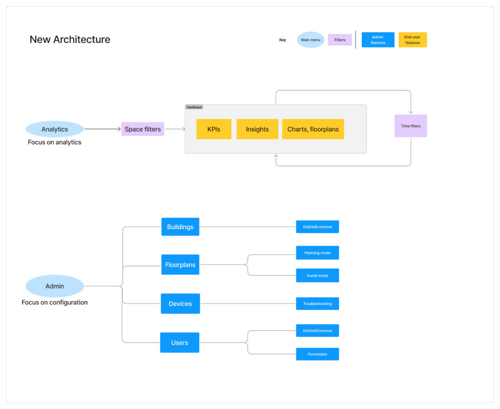
Information Architecture: From Separation to Scalability
My Approach: A Phased Strategy
During user interviews, I noticed admin users would navigate to different parts of the interface than end-users, often spending time in analytics features they rarely used. This behavior pattern revealed an opportunity for more targeted user journeys.
- Phase 1: Restructuring Navigation for Clarity. My first proposal was a minimal-effort solution: restructure the navigation to separate admin functions from analytics, giving each user type a clear, direct path to what they needed. I also introduced map layers so admins and end-users could toggle between device-focused views and space-focused views.
- Journey Mapping: I mapped out both user types’ typical workflows, discovering that admins spent 86% of their time on sensor configuration tasks that end-users never touched. This reinforced that separation was the right direction.
- The Outcome: Phase 1 improved clarity and reduced noise for both user types, but as operational needs grew it became clear each experience needed room to expand on its own terms.
- Phase 2: Building a Dedicated Admin Experience. As the business prioritized expanding to new sensor types and products, engineering needed to build significant admin infrastructure quickly — device provisioning, installer workflows, troubleshooting tools. In discussions with the engineering teams, we realized trying to build these features within the existing analytics app would slow us down and clutter the end-user experience. Together, we decided to create a dedicated admin experience with a sensor-centric view rather than an analytics-centric view, giving each user type their own focused space to evolve independently.
This separation strategy is still guiding the team’s product development today.
Information Architecture: Before and After
The Analytic Dashboard (End user) and the Device Health Portal (Admin user)


Symptom Example: Floor Map Redesign
The cluttered floor map demonstrated why separation was necessary. In the original interface, the real-time map tried to show both device types (for admins) and occupancy status (for end-users) simultaneously, resulting in a 10-item legend that served no one well. Once we separated the experiences, I could optimize each map for its specific user:
Analytics App – Real-Time Availability Map:
- Shows: Occupancy status only (Available, Occupied, Offline)
- Legend: 3 simple items
- Purpose: Help users quickly find available spaces
Admin Portal – Device Health Map:
- Shows: Sensor types and health status (Online/Offline by device type)
- Legend: Device-specific status indicators
- Purpose: Help admins identify which hardware needs attention
The same physical space, visualized two completely different ways based on what each user needed to accomplish.
Real-time Occupancy vs Device Health on the Same Map


Legend: Before and After

Symptom Example: Filter System Clarity
The original filter was another symptom of mixing admin and end-user needs. It exposed the full admin taxonomy—meant for admins to manage and edit tags—directly to analytics users who simply needed to filter by space categories (department and/or space type).
The Problem: A flat, multi-column list showing all possible tag combinations. Analytics users had to mentally map hierarchical relationships without visual guidance.
The Solution: For the analytics app, I designed a simplified hierarchical filter: a sequential select inputs allowing users to choose department, then space type, then additional categories, giving full flexibility for hierarchical tag filtering.
Filter Hierarchy Redesign

How I Used AI: Rapid Prototyping
Tool: Claude Artifacts | Purpose: Internal communication & early validation
Instead of waiting on design time to mock up the filter interaction, I used Claude Artifacts to generate a functional prototype directly from my requirements. I described the filter behavior I was proposing — category selection, hierarchy, multi-value logic — and Claude produced an interactive interface I could put in front of engineers and PMs immediately.
It wasn’t pixel-perfect, but it didn’t need to be. The structure and interaction were clear enough to align the team on direction before a single frame was opened in Figma.

Strategic Enablers
Design System: Strategic Adaptation
With tight development timelines, I strategically leveraged the existing design system rather than creating custom components. Engineering had implemented the SHADCN component library, so I created a Figma component library that mapped directly to their code components—buttons, inputs, filters, data tables, cards. The approach included:
- Documentation over invention: Rather than designing new patterns, I documented existing components and defined clear usage guidelines.
- Velocity prototyping: This alignment allowed me to prototype quickly while ensuring engineering could implement efficiently.
- Consistency by design: Using the same component library across admin and analytics experiences maintained visual coherence even as we built two separate products
This design system foundation became the standard for all future feature development and enabled the team to scale product design efficiently.
Collaboration: Presenting Options for Strategic Decision-Making
I learned to assess project priority, importance, and timeline before deciding whether to present the UX-ideal solution or prioritize low-effort engineering approaches. I developed a practice of offering design options sorted by anticipated implementation effort.
I established regular check-ins with both 8-person engineering teams, not just for handoffs but for ongoing design questions during implementation. This included providing alternative solutions when technical constraints emerged and making real-time decisions about interaction details.
Impact & Results
- Usage: 40% increase in weekly platform visits measured over 3 months post-launch
- Feature transformation: Real-time dashboard became the most visited feature after previously being the least visited
- Enhanced usability: Customers reported on routine calls how easy it became to analyze data and export insights for executive presentations
- Customer Success Quote: “For the first time, customers are asking us how to integrate the floor plan view into their office kiosks. They want to replace traditional wayfinding with our real-time occupancy data.”
- Internal Recognition: Received a company-wide “Kudo” for the project impact—specifically for improving customer perception of our platform’s sophistication.
- Business Value: Customers began incorporating our charts directly into their executive presentations because the visual clarity allowed external audiences to understand the insights without additional context.
Key Learnings and Insights
- Direct Customer Access Is Invaluable: Joining customer success calls provided insights that filtered feedback couldn’t capture—especially around emotional reactions and behavioral patterns that drive daily usage decisions.
- Present Options, Enable Strategic Decisions: Rather than aspiring to perfection, I learned to present design options from UX-ideal to low-effort implementation, then collaborate with teams to find the best balance for each situation. This approach consistently produced better outcomes than self-limiting designs based on assumed constraints.
- Design Systems as Strategic Tools: Adapting the existing design system (rather than creating custom components) allowed us to maintain quality while meeting aggressive timelines. The key was treating the design system as a strategic enabler—documenting what existed, defining clear patterns, and ensuring consistency across both products as they evolved independently.